The Mission:
Transform the UX from Outdated to Outstanding
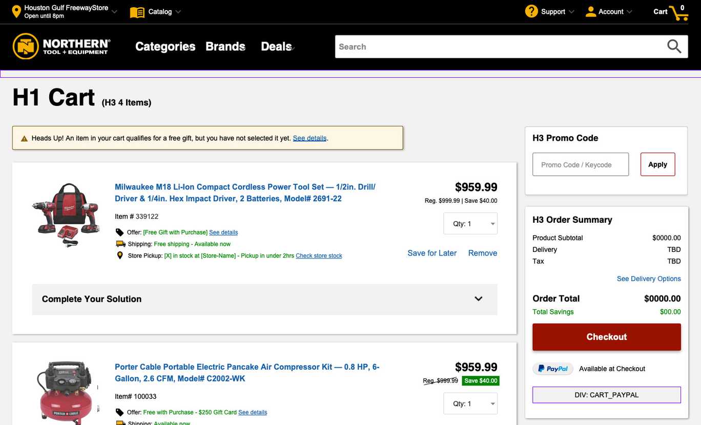
The existing HCL e-commerce site had outdated design issues, resulting in a less than stellar user experience. Additionally, the old theme was built in a time when accessibility and inclusiveness guidelines weren’t mainstream. While the marketing department stood firm against adding more colors, our task was clear – we had to revamp the UX design, make it completely accessible, and align it with the top eCommerce practices, all while sticking to the original black and yellow color scheme.
From Trainer to Leader
Initially, I was invited to the Northern Tool UX team as a guide on using Axure. But our common drive for superior UX, collaboration, and adoption of best practices fast became the glue that bound us. Recognizing the value of my experience and the potential of my best practices, the NTE team invited me to join them as the lead designer and front-end developer for the project’s entirety.
In this new role, I became the bridge connecting the designers and developers, preemptively ironing out communication hiccups. I also took the lead in mentoring the EY offshore front-end team and even took charge of all the SCSS and Typescript for the project’s theming.
One of my notable contributions was ensuring seamless communication between the designers and developers, thereby preventing potential roadblocks. Alongside this, I guided the EY offshore front-end team and assumed the responsibility of all SCSS and Typescript for theming.
Guided by Baymard Premium Research: Aiming for UX Perfection
With the backing of Baymard Institute’s Premium suite of research, we were privy to an exhaustive compilation of over 110,000 hours of extensive UX research. This treasure trove of insights helped us identify the usability roadblocks our previous designs posed and allowed us to learn how to construct user experiences that truly set the bar high.
Leveraging this data and my professional experience, I suggested – and the NTE team agreed – that the redesigned site should adhere to a proven set of best practices for readability. This set of guidelines was rooted in research and aimed to optimize the user’s reading experience.
Best Readability Practices:
- Incorporating The 8 Point Grid System: By using this system, we ensured consistency and harmony in our design, creating a visually pleasing and easily navigable interface.
- Using visual and semantic space: This practice enabled us to design an interface that was appealing and user-friendly, preventing the site from appearing cluttered or overwhelming.
- Providing the right amount of space between lines of text: Research shows that the ideal line spacing improves readability by making the text more digestible for the user.
- Implementing clean typography: Clean, simple fonts were chosen to enhance legibility and improve the overall user experience.
- Maintaining visual hierarchy: By using size, color, and position to distinguish elements, we effectively guided users’ attention to the information they needed.
- Avoiding the use of all caps: Research indicates that text in all caps can be harder to read and slow down users.
- Eschewing underlined text: Underlining can often be mistaken for a link, potentially confusing users.
- Using left-aligned text: As most languages read from left to right, left alignment is easier on the eyes and aids in comprehension.
- Keeping lines of text to around 70 characters: This length is considered optimal for readability, as it prevents the reader’s eyes from tiring.
- Supporting text resizing: This inclusive practice ensures users can adjust the text size to their comfort, enhancing the overall user experience.
Challenging the Software Conundrum:
Navigating the Intricacies of an Enterprise eCommerce site to Overcome Obstacles
At the dawn of our development journey, we quickly recognized the fresh terrain of the HCL Commerce 9.0 software was yet to be thoroughly road-tested. For over six months, we grappled with extracting the necessary backend data for theming. Our project manager was firm on the decision not to dedicate resources to curate mock data. This posed a challenge – without data, my hands were tied. I was unable to proceed with theming and the front-end developers were stalled without components to create.
Unexpectedly, the solution to our dilemma was embedded in the overwhelming complexity of our colossal eCommerce venture. Each morning, our Northern Tool Scrum became a strategy session, where I collaborated with the team to devise a daily plan. When the category landing pages hit a snag, I navigated the maze of our project to discover other site sections that were accessible. Whether it was a content management page, a highlighted banner component, or even revisiting sections to troubleshoot potential accessibility issues, I found a way to press forward. While other aspects of the project encountered delays, I persistently advanced with theming, crafting high fidelity pages for our Quality Assurance team to evaluate.
This approach not only kept our project moving but also demonstrated the value of adaptivity and resourcefulness in the face of challenges.
Learning Hurdles: Navigating the Learning Curve of WCAG 2.1 Compliance
The journey to absolute WCAG 2.1 compliance was a steep learning curve for our team at EY. We partnered up with Accessible360.com (now known as Allyant.com) to audit and guide us through enhancing our website’s accessibility. However, the scarcity of HTML to audit at the start, due to software impediments, presented a challenge. These delays, at the outset, meant we could only add notes to the low fidelity wireframes.
Despite the initial apprehensions, we saw an opportunity for growth. Northern Tool had contracted Accessible360/Allyant for two audits – one for the initial site and another post-QA. As the component development started to take shape, it was evident that our front-end team, proficient in React.js, needed training in pure HTML. Recognizing this gap, I started offering mentoring and training on HTML coding fundamentals, backed by the support of one of our managers.
Balancing theming tasks and auditing all components was an uphill task. Aware that errors could slip through, potentially causing further developmental delays, I took the initiative to work with the Northern Tool UX manager. We agreed to have Accessible360/Allyant spend two days reviewing our code and identifying potential issues.
Unfortunately, we encountered a setback when the EY project manager did not perceive the necessity to utilize this resource. This oversight resulted in an additional three months of additional development, solely dedicated to fixing the accessibility.
However, every cloud has a silver lining. These additional months of dedicated work on accessibility issues transformed us into WCAG accessibility experts. This journey underscored the value of sprint retrospectives as a learning tool — not just for our team, but also for the project manager. This experience has enriched my problem-solving skills and deepened my understanding of project management, making me an asset to any team that values growth through challenges.
Creating Dynamic Web Components Triggered by HTML Classes
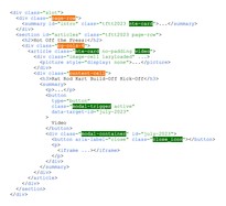
HCL Commerce uses a Content Management System without JavaScript functionality. My job was to create unique HTML class-triggered component framework that could allow elements like accordions, lists and popup dialogs on the website’s content pages. To accomplish this, I developed a set of Typescript utilities that scan each page for specific class names that activate the desired features. This innovative system is documented in Storybook, for easy reference.
A Sampling of the NTE Custom CMS Class Based Components:
- Grid (structure) Layout
- Flex (content) Layout
- Carousel
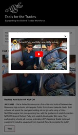
- Modal Dialogs
- Drawers
- Media Windows
- Custom Banners (with and without background image)
- Responsive Background Images
- Responsive Spacing Classes
Outcomes and Lessons
The successful completion of the Northern Tool + Equipment HCL e-commerce site transformation project generated beneficial outcomes and valuable lessons.
Through enhancing the site’s usability and accessibility, we achieved a superior user experience. This improvement resulted in elevated levels of customer satisfaction, confirming our hypothesis that good design and usability practices directly impact user approval.
Furthermore, the project also underscored the importance of partnering with accessibility experts to ensure WCAG 2.1 compliance. Despite initial hurdles, our team emerged as accessibility experts, a skill set that will prove invaluable in future endeavours.
Relying on the comprehensive insights from Baymard Institute’s Premium suite of research was a game-changer in our approach to designing a user-friendly e-commerce site. The extensive compilation of UX research findings enabled us to identify and rectify usability roadblocks, elevating the overall quality of our redesign.
Navigating through the complex landscape of an enterprise e-commerce site to overcome challenges reinforced the value of adaptability, resourcefulness, and resilience. It demonstrated that with strategic planning and proactive problem-solving, progress can be achieved even in the face of obstacles.
Understanding and optimizing the intricacies of HCL Commerce’s Content Management System proved to be a unique challenge. The creation of a unique HTML class-triggered component framework allowed for dynamic web components without JavaScript functionality, a novel solution that expanded the capabilities of the site.
In conclusion, this experience has enriched my problem-solving skills, deepened my understanding of project management, and underscored the importance of accessibility and usability in e-commerce site design. This experience has been an invaluable lesson in growth through challenges, making me an even more valuable asset to any team committed to continuous learning and improvement.


