Why and What is It?
Every new project opened the same way: a deconstruction dive. Find out what the last team built on, and how well. Set up the grid. Size the type. Wire the breakpoints. Implement, fix, or update the css reset. Most often the existing design didn't adhere to the best practices I've picked up during my career. So I stopped the deconstruction — I built my own framework once, carried it site to site, tightened it a little on each project. Experimented with features. Kept or tossed them as need be. Octet-SCSS is what I've named the framework, and it is now cleaned up enough to share.
The Cornerstones of Octet-SCSS
An 8-Point Vertical Grid
The 8-point grid is a layout method where every dimension — spacing, padding, margins, component sizes — is a multiple of eight. One number, repeated. It's common practice for a reason: screen sizes are mostly divisible by 8, so values land on clean pixels instead of blurry half-pixels; choices collapse to a predictable scale (8, 16, 24, 32), which speeds decisions; and designers and developers end up speaking the same spacing language, which cuts handoff errors.
Octet-SCSS builds that in. Elements line up that were never told to. Rhythm holds across a layout without anyone eyeballing it. The math stays human, too — designers hand off in pixels, and eight divides cleanly: gridx(2) is 16px, gridx(3) is 24px, readable at a glance with no calculator.
None of this is novel — the 8-point grid is well-documented. It's the foundation the Octet-SCSS framework is built around. What's mine is spacing that scales without leaving the grid, and type that does the same.
* The scale allows a 4px half-step for tight spots where 8 feels too chunky — a standard micro-adjustment. The base unit is also configurable: eight is the default, but $grid-base takes whatever your system wants.

Spacing that Scales Responsively
Responsive spacing used to mean hand-writing the same media-query scaffolding for every block — the numbers rarely changed — repetitive and prone to errors as the code base grew and teams changed. Octet's mixin scaled-spacing() replaces all of it with a single call.
The mixin does two jobs at once. It sets a space, and it scales that space with the viewport — climbing by a fixed grid-step at each breakpoint, so a gap that's tight on a phone opens up on a wide screen without ever leaving the baseline. One line sets a block's whole responsive rhythm: @include scaled-spacing(margin-bottom, 5, 88px) — grow to 88px across up to seven breakpoints (you choose breakpoint count at the @include call), every step a multiple of eight.
Here's a living example:

Optional: clamp() for Gutters
Vertical rhythm has to land on the 8-point grid. Horizontal gutters don't — as they sit between columns, not on a baseline — so grid-locking them would be more work. The fluid-gutter() mixin is the optional counterpart: it slides a gap smoothly with clamp().
Headlines That Scale
Body copy shouldn't grow with the window. A paragraph that swells on a wide screen is just a worse read — longer lines, lost place. So it doesn't: paragraphs and lists sit at a fixed, comfortable size, in rem, so a reader who raises their browser's default still gets the bump.
Spacing scales by stepping between breakpoints; type scales by sliding, with only its line-height snapping to the grid.
Headlines are different — they should scale with the viewport. fluid-font-size() does it with one self-bounding clamp(), no media queries: a size that grows smoothly between a floor and a ceiling as the screen widens.
The catch most fluid type misses is line-height. Let leading scale freely with the font and it drifts off the baseline grid — text that no longer lines up with what's around it. This mixin snaps line-height to the grid with CSS round(), continuously — at every width, not just at breakpoints. The font scales smooth, the leading tracks it, and both stay on the eight-point grid the whole way. Same principle as the spacing, pointed at type: scale freely, never leave the rhythm. Browsers without round() fall back to a clean unitless ratio — they just don't get the grid-snap.
One headline, three screens. The font shrinks with the viewport — 64 to 53 to 37px — and the line-height follows it down the grid — 72, 64, 48, sticking to the baseline grid.


Philosophical Good Stuff
One File Owns the Spacing
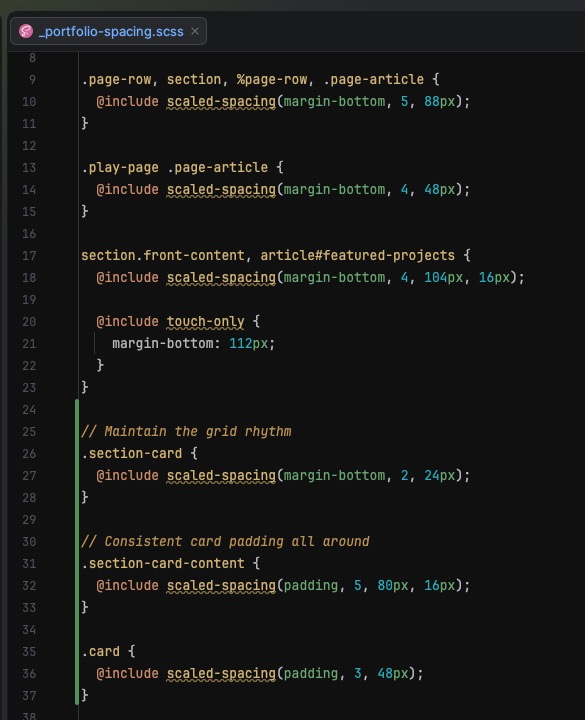
Every layout space on this site lives in one partial — _spacing.scss — and nowhere else. Margins between sections, padding inside cards, the rhythm between list items: all declared in one place you can read top to bottom.
This is the part I'd defend hardest. When spacing scatters across a dozen component files, no two sections end up quite the same, and finding out why means opening a dozen files. Pull it into one, and the rhythm is consistent by construction — every space is a deliberate line in a single ledger, not an accident distributed across the codebase. Change the rhythm in one place; audit it in one place.
Spacing internal to a component — padding inside a card — still lives with that component. It's layout spacing, the space between blocks, that centralizes. The distinction is the whole point: the stuff that has to stay in rhythm across the page is governed together.
Everything Pushes Down
Spacing between blocks is always margin-bottom, (almost) never margin-top. Every block pushes the next one down, so space flows in one direction — top to bottom, the way you read.
One direction fixes a specific, maddening problem: margins that fight. Put a bottom margin on one block and a top margin on the next and they don't add up — the bigger one wins, sometimes, depending on collapse rules nobody remembers. Pick one direction and that whole class of bug disappears. "How far apart are these two blocks?" always has one answer, and it's on the block above.
The rare exception earns itself: a caption belongs under its image, so it gets a top margin. Everything else pushes down. One rule, one direction, one place to look when the spacing's wrong.
Pixels for Layout, rem for Reading
Designers think in pixels. Figma says 24px, Dev Mode says 24px, so the code says 24px — no translation, no drift between what was drawn and what coded. Layout stays in pixels for exactly that reason: structure lands where it was designed.
Text is the exception. Body copy is set in rem, so when a reader raises their browser's default font size the words grow with them. Pixels would ignore that entirely.
Everything Else
The rest is the quiet stuff I think a framework should just have:
- Accessibility-ready (WCAG AA) — focus-visible ring,
.sr-only, skip link, reduced-motion reset, on by default - Motion tokens — durations, easings, and a
transition()mixin that self-disables under reduced-motion - Z-index scale — named stacking layers, no magic numbers, to end the z-index nightmare
- Elevation — layered shadows, nine graduated levels
- Modern CSS reset — box-sizing, zeroed margins, sensible element defaults
- Max-readability measure —
$layout-readable-width(default 720px) for comfortable line length
Thanks for Reading
Please Feel Free to Kick the Tires
No framework gets built in a vacuum. This one owes a debt to the designers and engineers I've worked alongside over the years — the ones who argued about spacing scales, cared whether a thing landed on the grid, and made me sharpen why I did what I did. You know who you are.
Octet-SCSS is on GitHub, MIT-licensed, and still moving. If you use it, break it, or have a better way to do any of this, I'd like to hear. Take a look, open an issue, make use of it.